Mastering SaaS Landing Page Best Practices: A Blueprint for Conversion Success
In today’s competitive SaaS landscape, your landing page isn’t just another touchpoint – it’s where first impressions are made. For B2B SaaS companies, effective landing page design is particularly important. A successful SaaS landing page must bridge the gap between initial interest and in-depth research, serving as the crucial first step in customer acquisition that can span months.
Think of your landing page as an intro call with a prospective customer. While paid ads might get someone to pick up the phone, it’s your landing page that needs to speak their language, understand their pain points, and present your solution in a way that resonates with decision-makers.
What sets high-converting landing pages apart isn’t just fancy design elements or persuasive copy – it’s their ability to facilitate a seamless transition from marketing to sales. That transition is ultimately a function of broader marketing strategy, not just page design.
In the B2B SaaS world where product features are often sophisticated, pricing structures complex, and buying decisions involve multiple stakeholders, your landing page needs to do more than just showcase key features; it needs to educate, build trust, and initiate meaningful dialogue.
This comprehensive guide to SaaS landing page best practices will walk you through essential elements that make an effective landing page, from crafting compelling hero sections to leveraging interactive elements effectively. We’ll explore real-world landing page examples from industry leaders who have mastered these principles, breaking down what works and why.
Let’s dive into the key creative and messaging elements that make an effective SaaS landing page.
SaaS Landing Page Best Practices 101
- Hero Section
- Problem/Solution
- Benefits and Key Features
- Social Proof
- Product Demonstration
- Creating Urgency
- FAQs
Creating an Effective Hero Section
Definition: The first section of a landing page contained above the fold.
The hero section is the first section a user sees and interacts with, making it crucial for user experience and bounce rate optimization.
Within 10 seconds, your hero section needs to communicate three things:
- What your product does
- Why it’s important for potential users
- A clear CTA that guides visitors to take a desired action
It is typically broken down into several elements:
- Image or Video: Showcasing the product or offer making it more relatable.
- Headline: A bold statement explaining the product/service and value proposition.
- Sub-headline: A second, more factual statement clarifying the headline.
- Call-to-action: A specific action you want the user to take, and steps to get there.
- Actionable Steps: Positive outcomes from completing the specific action.
- Social Proof: Testimonials, client logos, reviews/ratings
Let’s take a look at two examples from Figma and WiseStamp.
Full Figma Landing Page
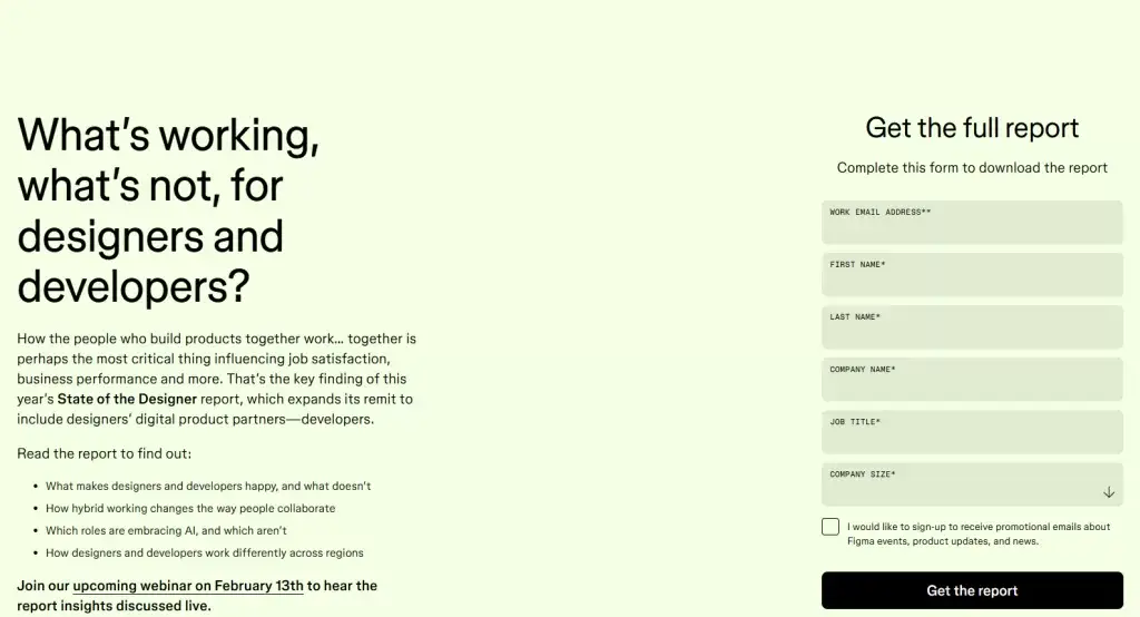
It’s easy to tell the following:
- What the product does: Design project management
- Why it’s important: Creating a cohesive design and development workflow
- What they want you to do: Download their report
The page does a good job of outlining the report, what the user will learn, and actionable steps (including clear CTA).
This page could have benefited from some imagery previewing the report, or reviews from readers of the report.
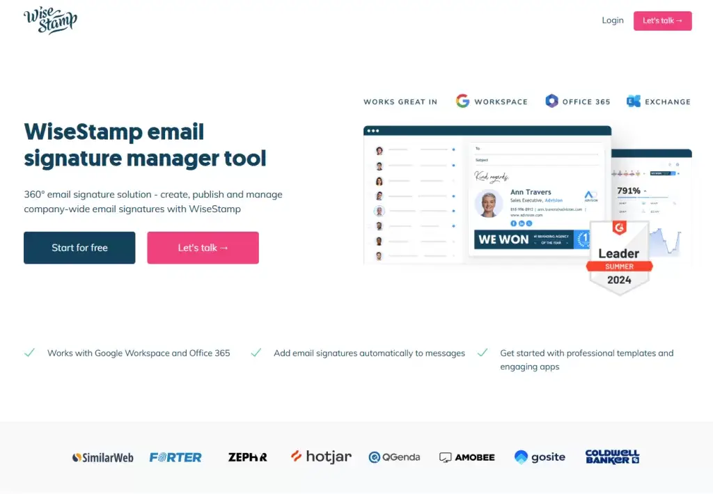
You can easily tell:
- What the product does: Email signature tool
- What they want you to do: Try the tool or request a demo
The page does a good job incorporating imagery and social proof to better showcase the product.
However, the ‘why’ is missing. Nothing in the hero section communicates the purpose of the product or what positive outcomes result from using the product.
If the Hero acts as a hook, information that lacks bold, eye-catching statements will struggle to drive engagement.
Once you have the user’s attention, it’s time to resonate with the problem they are facing.
Problem-Solution Alignment
Every effective landing page needs to address specific pain points that your SaaS solution solves.
The reason this works is the psychological behind why we buy: users engage when messaging reflects meaningful problems, emotional relevance, and identity alignment.
This helps relate your product to potential customers by addressing something they’ve experienced. Keep in mind that good products solve multiple problems, and this allows you to drill down into different avatar personas.
This section should include:
- Clearly articulate common challenges your target audience faces
- How your product features provide a solution
- Include interactive elements that demonstrate the solution in action
Zapier masterfully demonstrates this approach. See full landing page.
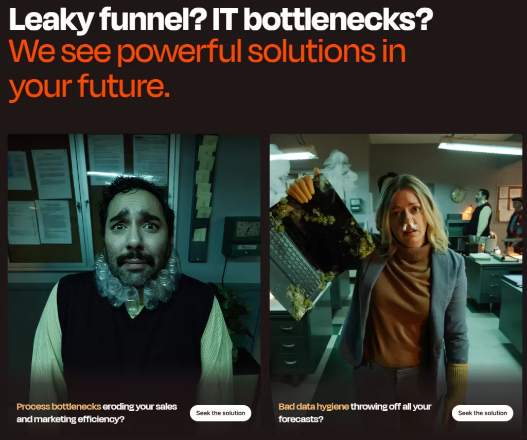
Different colored text highlights specific problems, making pain points immediately visible to visitors
Furthermore, they seamlessly blend the solution with an interactive product demonstration.
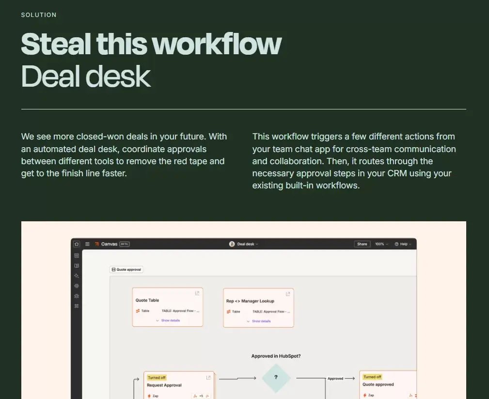
This approach performs two functions – it validates the visitor’s challenges while simultaneously showing them exactly how Zapier solves their problems
Best practice: When you can combine multiple elements like problem/solution and product demonstration, you create a more cohesive and compelling user experience.
By now, the product or service should be clearly explained. It’s time to turn focus to differentiated values.
Showcasing Benefits and Key Features
Once you’ve established your problem/solution fit, it’s crucial to differentiate your SaaS product in a crowded marketplace. Your benefits section needs to clearly communicate:
- Unique selling propositions
- Differentiated value that sets you apart from competitors
- Quantifiable benefits backed by data
Shopify provides an interesting example of benefits presentation. View the full landing page.
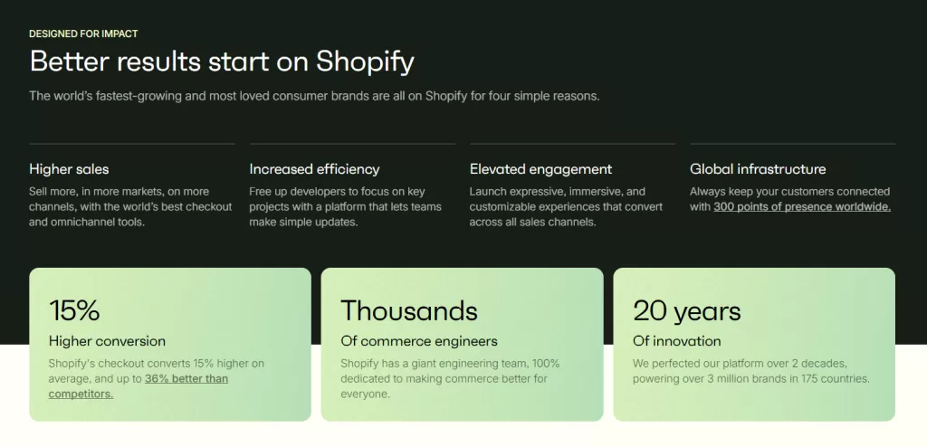
Their approach uses digestible bullet points paired with supporting data, making the value proposition clear and credible. However, their execution reveals an important lesson about audience targeting. While the benefits are well-articulated, they take a broad, generalized approach rather than speaking to a specific audience segment.
This “catch-all” strategy might work for an industry leader like Shopify, but it’s often more effective to tailor your benefits to specific audience segments. Smaller SaaS companies often find greater success by focusing on niche market needs.
Best practice: Align your benefits section with your target audience’s specific needs and pain points. A focused value proposition that speaks directly to your ideal customer is often more compelling than a general one.
Leveraging Social Proof
In the B2B SaaS world, trust is everything. Social proof through testimonials and case studies show potential customers exactly what success looks like with your product.
Let’s examine some best practices for both.
Testimonials
Best practices to follow:
- Choose at least three of your most hard-hitting examples.
- Keep them short, bold text to highlight the key points.
- Speak to a common customer pain point, objection, or result.
The key is to address specific outcomes a potential customer will be looking for.
6Sense blends testimonials with data to demonstrate success . View the full landing page.
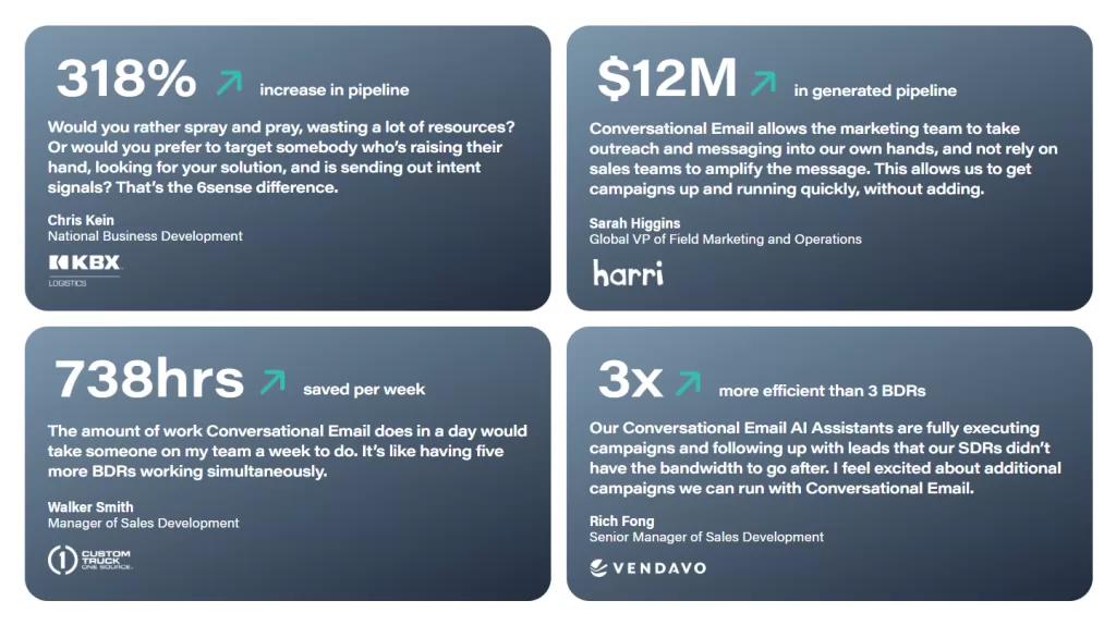
Each testimonial is tied back to a key performance indicator (KPI) associated with each business. This not only shows the product works but also shows how to measure it.
To improve this section further, the pain points addressed in each testimonial could highlighting specific pain points in contrasting colors making the important points more visible to visitors skimming the page.
Take it a step further, and turn these messaings into ads that convert by simply leveraging customer feedback.
Case Studies
Case studies take social proof a step further by diving deeper into customer success stories.
Best practices to follow:
- Summarize success with 1 or 2 key metrics.
- Feature recognizable company logos/brand names.
- Include a brief description of the work and link out to the full case study.
Two companies demonstrate different but effective approaches
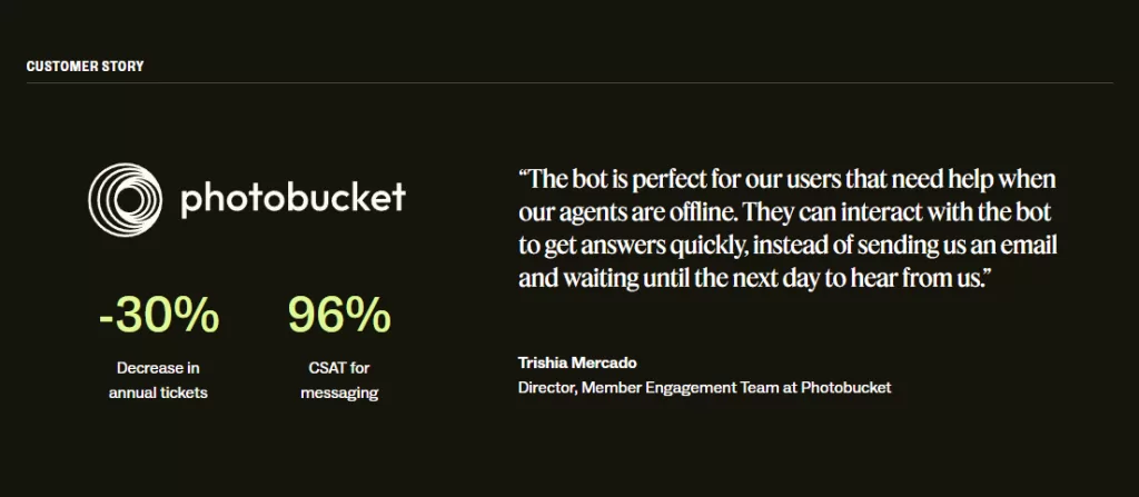
This is another example of a case study and testimonial blend, succinctly communicating the success qualitatively and quantitatively.
For those seriously considering, it would be helpful to have a link to learn more about the product and how the case study was conducted.
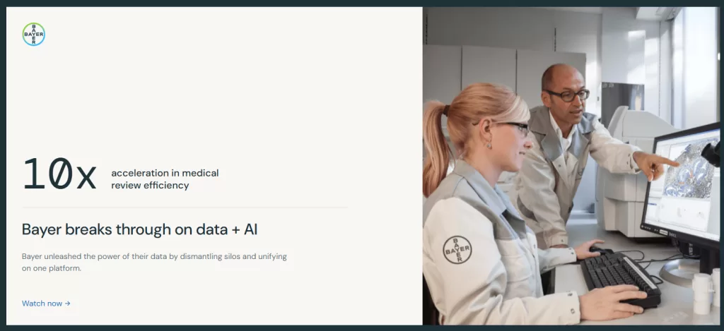
The case study links out to a video session explaining their work with Bayer. This multimedia strategy caters to different engagement preferences while adding more in-depth content.
The landing page section could benefit from more detailed info on the case study for those simply skimming the page, particularly in explaining how the key metric translates to business impact.
Best Practice: Layer different types of social proof throughout your landing page, using a mix of testimonials and detailed case studies to build credibility with visitors at each stage of their journey.
Check out some of my case studies for inspiration. The key is picking key metrics that communicate the success of a product or service.
With trust established through social proof, let’s explore how to showcase your product’s capabilities effectively.
Creating an Interactive Product Demo
While detailed product explanations are important, nothing builds confidence quite like first-hand experience with your solution
A well-crafted product demonstration section serves as a bridge between marketing and sales, giving potential customers their first taste of your platform’s value.
Let’s examine two approaches to product demonstrations.
Remote uses an interactive element to mimic an actual in-person demo.
This approach enables:
- Access to core functionality
- Answers to common questions
- On-page engagement
This allows prospects to build confidence with the product prior to a sales call, making the call more productive.
Bravado’s SalesGPT demo takes a slightly different approach.
Users are able to demo the product and see practical use cases through pre-built prompts.
However, prompting users to sign up for an account before seeing results limits exploration.
Bravado could benefit from a test environment that allows users to demo SalesGPT before signing up.
Best Practice: Balance demonstration with lead generation. More hands-on experience will drive deeper engagement and consideration.
With your product’s capabilities clearly demonstrated, it’s time to focus on converting this interest into action.
Driving Action Through Urgency
Urgency is the mechanism that drives users to complete an action. While your your product value might be clear, humans have a tendency to delay decision-making.
This is where urgency becomes crucial, through several means:
- Scarcity: The limited nature of the offer (time sensitive, limited availability).
- Positive outcomes: What will happen if they complete the action.
- Avoiding conflict: What won’t happen if they do not complete the action.
HubSpot masterfully combines two powerful motivators. View landing page here.

- Time-sensitive opportunity (“one-time-only masterclass”)
- Clear value proposition (positive learning outcomes)
Other effective ways to incorporate scarcity include:
- Countdown timers
- Limited supply
- High demand (Waitlists, Pre-Orders)
Gusto takes a different approach, focusing on a simplified action plan with positive outcomes. View page here.
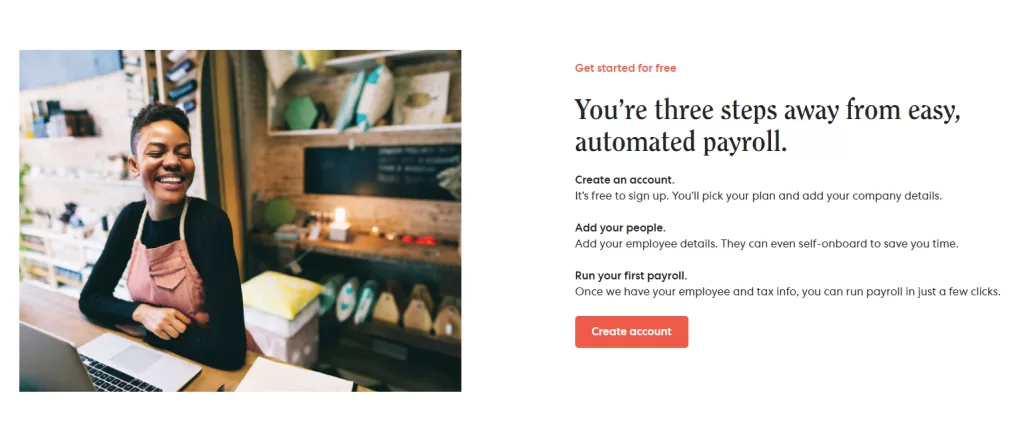
This example demonstrates how to effectively:
- Reduce friction with a clear actionable plan
- Tie positive outcomes to action
- Limit confusion with a simple three-step process
Best Practice: When creating urgency, follow the “rule of three” for action steps. This provides enough detail to guide but not overwhelm potential customers.
With urgency established, let’s address any final hesitations that might hold visitors back from converting.
Addressing Objections with FAQs
Frequently Asked Questions (FAQs) are a final opportunity to address hesitations that are holding back users from converting.
Positioned at the bottom of your landing page, FAQs can offer that last bit of confidence needed to take action.
Best Practice: Questions/Answers can easily be sourced from sales calls or user-submitted feedback surveys.
Let’s take a look at how Heatmap executes this effectively. View full landing page.
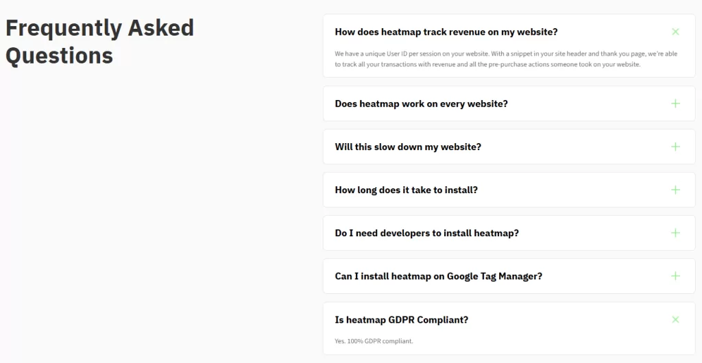
This approach does three things particularly well:
- Questions are fundamental, but address common objections
- Answers are clear and concise, making them easily readable.
- Addresses concerns while saving more in-depth topics for sales conversations
Best Practice: Your FAQ section should remove obstacles to conversion, not create new ones. Keep answers simple and direct, always maintaining a clear path to your call-to-action.
Turning Best Practices into Results
Creating high-converting landing pages for your B2B SaaS business requires a strategic approach to both design and content. By following these landing page best practices and continuously optimizing based on user behavior and A/B test results, you can create pages that not only attract potential customers but effectively guide them through their decision-making journey.
Remember that your landing page isn’t just about immediate customer acquisition – it’s about starting meaningful conversations that lead to long-term partnerships. Turning these principles into consistent performance requires both a structured creative production process and a disciplined approach to creative testing.
For a deeper look at how these systems work in modern advertising environments, see my guides on creative production for performance advertising and creative testing in the age of algorithms.
