
The Last Google Ads Dashboard You’ll Ever Need
Google Ads dashboards often start with the goal of speeding up time to insight. Put KPIs front and center and keeping tabs on performance will be a piece of cake. Right?
Not always. The truth is that most dashboards end up becoming a prettier version of the platform UI. Sure, they show change over time, but they lack a focus on real problems.
It’s not enough to have charts listing key metrics — they need to tell a story. This is where the real work lies.
To build a useful dashboard, a solid data model and diagnostic workflow are crucial. That includes a focus on what problems often need to be solved.
I recently built a Google Ads reporting template using Google Sheets, Supermetrics, and Streamlit. The goal was to create a reusable dashboard that could move from performance reporting to actual optimization guidance.
This article explains how I got there, and the purpose-built goals it aimed to solve. Stick around until the end and I’ll give you a link to my templates.
TL;DR
A useful Google Ads dashboard is not just a set of charts. It is a decision system. This article breaks down how to structure raw data, mapping tabs, model tables, benchmarks, and dashboard views so reporting leads to clearer optimization actions.
Start With the Decisions, Not the Charts
Most dashboards start with one-dimensional questions like:
- What charts should we show?
- Should we show device?
- Do we want to track trends?
These miss the entire point of information in a dashboard – it’s meant to guide decision-making under uncertainty.
To this end, the dashboard needs to be designed to answer key questions faced by advertisers. This follows a very similar format to the monthly reporting framework I use to drive marketing strategy.
Suggested Dashboard Decision Map
The dashboard is a collection of tabs – each focused on identifying different areas of opportunity. They also each speak to different levels of analysis.
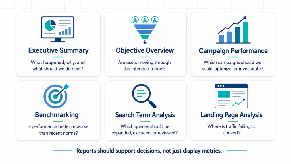
These sections are key to successful Google Ads campaign management not because they give a performance read, but because they diagnose the most common areas Google Ads campaigns fail.
The final output is streamlined to answer questions, but to get there, first a data model needs to be built.
Build a Data Model to Feed the Dashboard
Raw platform exports contain the data needed to do deeper analysis, but lack the consistent analytical backbone needed to create clean dashboards.
That data can be bucketed into general groups:
- Campaign performance
- Conversion actions
- Search terms
- Landing pages
- Devices
- Geos
How this data is formatted into sheets is what drives clean analysis and reporting.
Separate raw data, model data, and report data
The backbone of any reporting workflow is data mapping and modeling. To this end, there are four component parts to creating data structure.
| Layer | Example Tabs | Purpose |
|---|---|---|
| Raw | raw_campaign_daily, raw_search_terms | Source data from Supermetrics |
| Mapping | map_campaigns, map_search_terms, map_conversion_actions | Business logic and classification |
| Model | model_performance_canonical, model_search_terms | Cleaned and normalized data |
| Report | report_exec_summary, report_search_terms | Dashboard-ready outputs |
The dashboard shouldn’t be responsible for interpreting messy raw exports in real time. The sheet should do the modeling, and the dashboard should work with clean reporting tables.
This is where the thought goes into what is shown in the dashboard long before the dashboard is started.
Define Objective-specific Funnels
This is where the dashboard starts to become strategic. In Google Ads, objectives matter more than most. With clicks coming at a premium, understanding how well clicks translate to action is absolutely necessary.
Objectives set a goal for an engagement (click). For a charter school looking to enroll new students, objective flow might look like:
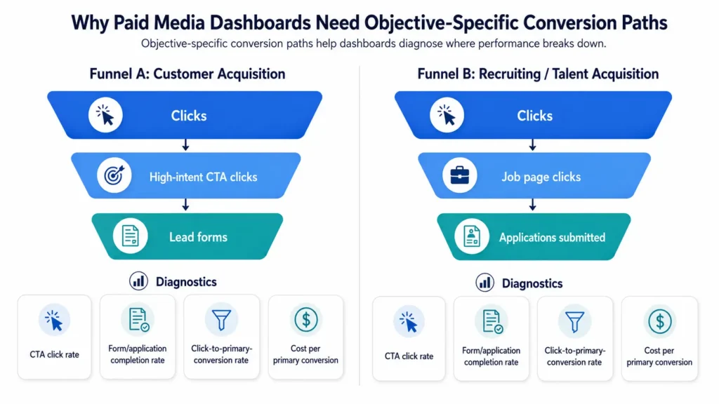
Metrics define steps in the user journey that lead to the ultimate goal. Defining these metrics in a report connects user activity to the bottom line goals of the business.
Example metrics include:
- Apply Now Rate = Apply Now Clicks / Clicks
- Form Completion Rate = Enrollment Forms / Apply Now Clicks
- Click-to-Form Rate = Enrollment Forms / Clicks
- Cost per Enrollment Form = Spend / Enrollment Forms
Often times, ad accounts will have more than one funnel. Metrics for each funnel provide a pulse check into campaign performance, and a place to start diagnosis.
I talk about how this works in the context of landing pages in Why Conversion Rate Is Not Enough to Analyze Landing Pages.
Create Priority Conversion Definitions
Conversions can be split into two main buckets: priority conversions and micro-conversions. Read more about micro-conversions in Meta Ads KPIs.
Priority conversions contribute directly to a business objective. In the case of a charter school enrolling students, a primary conversion would be an interest form submission.
Micro-conversions are actions a user takes on site that indicate interest. These could be a click on an ‘apply now’ button, or a form start.
To better understand campaign quality, a conversion quality ratio offers an easy way to grade individual campaigns.
Conversion Quality Ratio = Priority Conversions / All Conversions
If a campaign has high all-conversion volume but low priority conversion volume, the issue may not be traffic volume. It may be the optimization action mix.
Turn Campaign Reporting into Campaign Decisions
Calculated metrics like conversion quality ratio in turn inform campaign optimization. As an marketer, data informs whether the campaign needs to:
- Scale
- Optimize
- Maintain
- Investigate
Metrics offer a comparison across campaigns to identify this. Take this example:
| Campaign | Objective | Tactic | Spend | Priority Conv. | Priority CPA | Quality Ratio | Action |
|---|---|---|---|---|---|---|---|
| Campaign A | Enrollment | Nonbrand Search | $5,000 | 20 | $250 | 0.45 | Optimize |
| Campaign B | Recruitment | Nonbrand Search | $1,200 | 80 | $15 | 0.90 | Maintain |
| Campaign C | Enrollment | PMax | $3,500 | 0 | — | 0.05 | Investigate |
It’s easy to quickly identify that PMax is severely underperforming. Either the strategy needs to change or it needs to be paused.
Campaign reporting should not just rank campaigns. It should classify what kind of management action each campaign needs.
Benchmark Against Context, not Industry Averages
Reporting needs to include benchmarks – it’s how metrics have context. I’ve reviewed how to set up forecast ad performance, which relies heavily on both industry and historical benchmarks.
This dashboard takes that very manual process and automates it.
Read more about how campaign reporting can be automated in How I Automate Weekly Reporting
To make benchmarks more useful, they need to be categorized to look at different parts of the strategy. This involves
- vs prior month
- vs trailing 3-month median
- vs same month prior year, where tracking is reliable
- vs objective average
- vs campaign type average
- spend share vs conversion share
The logic is simple – use historical data to analyze today’s performance through multiple lenses.
- How are we doing Y/Y
- How are we trending this year
- How are we doing in particular areas of the strategy
Answering these questions gives a quick read on what needs the most attention.
Use Natural-language Takeaways
Even savvy marketers will miss details when looking at spreadsheets of numbers. Natural language helps identify the opportunities in easy-to-understand callouts.
However, that doesn’t mean leave the analysis up to LLM-generated summaries. Start with deterministic rules.
Example rules:
- Forms up + cost per form down = efficiency improved
- Spend down + conversions up = audience/traffic efficiency improved
- Micro-conversions up + primary conversions flat = funnel friction
- Clicks up + micro-conversions flat = traffic quality or CTA issue
- CPA up + conversions down = performance deterioration
The goal is not to make the dashboard sound smart. The goal is to make it explain the same performance logic a strategist would infer naturally.
Aggregate Search Terms by Use Case
Search terms are a core optimization lever in Google Ads, even though they’re quickly becoming obsolete with campaign types like Performance Max.
The problem with search term analysis is volume. Daily search term data explodes into thousands or tens of thousands of rows.
A better solution is looking at search terms on a monthly grain, and categorizing. This answers questions like:
- Is this theme driving qualified traffic?
- Is this query aligned with the campaign objective?
- Is spend leaking into low-intent searches?
The real value comes from classification. Instead of treating search terms as a massive flat table, taxonomies simplify decision making.
This helps identify whether particular topics are driving high impression volume but low clicks, or high clicks but no conversions.
These may be places to optimize campaign delivery, or onsite experience – especially since landing pages are such a vital part of Google Ads performance.
Avoid Adding Every Possible Breakout
It’s tempting to add granular breakouts that are used every once in a while – think things like device, time of day, or geo.
While these are useful, they’re not usually the first things to look at. To save the trouble of supporting a data model with high complexity, leave this out of a v1 dashboard.
Generally, only add them if they support a recurring decision. Here’s a good way to think about adding them:
| Breakout | Add in v1? | When It Matters |
|---|---|---|
| Device | Maybe | If mobile clicks fail to become forms/applications |
| Time of day | Usually no | If hourly conversion volume is high enough |
| Geo | Maybe v2 | If campaigns are market/local-driven |
| Search IS | Yes if populated | If budget/rank/headroom decisions matter |
| Auction insights | v2 | If competitive pressure is a recurring issue |
More granularity is not always more insight. Sometimes it is just more maintenance.
The Final Architecture
The final version of the dashboard was not just a Streamlit app sitting on top of a Google Ads export. It was a small reporting system with a clear separation between data extraction, modeling, reporting, and presentation.
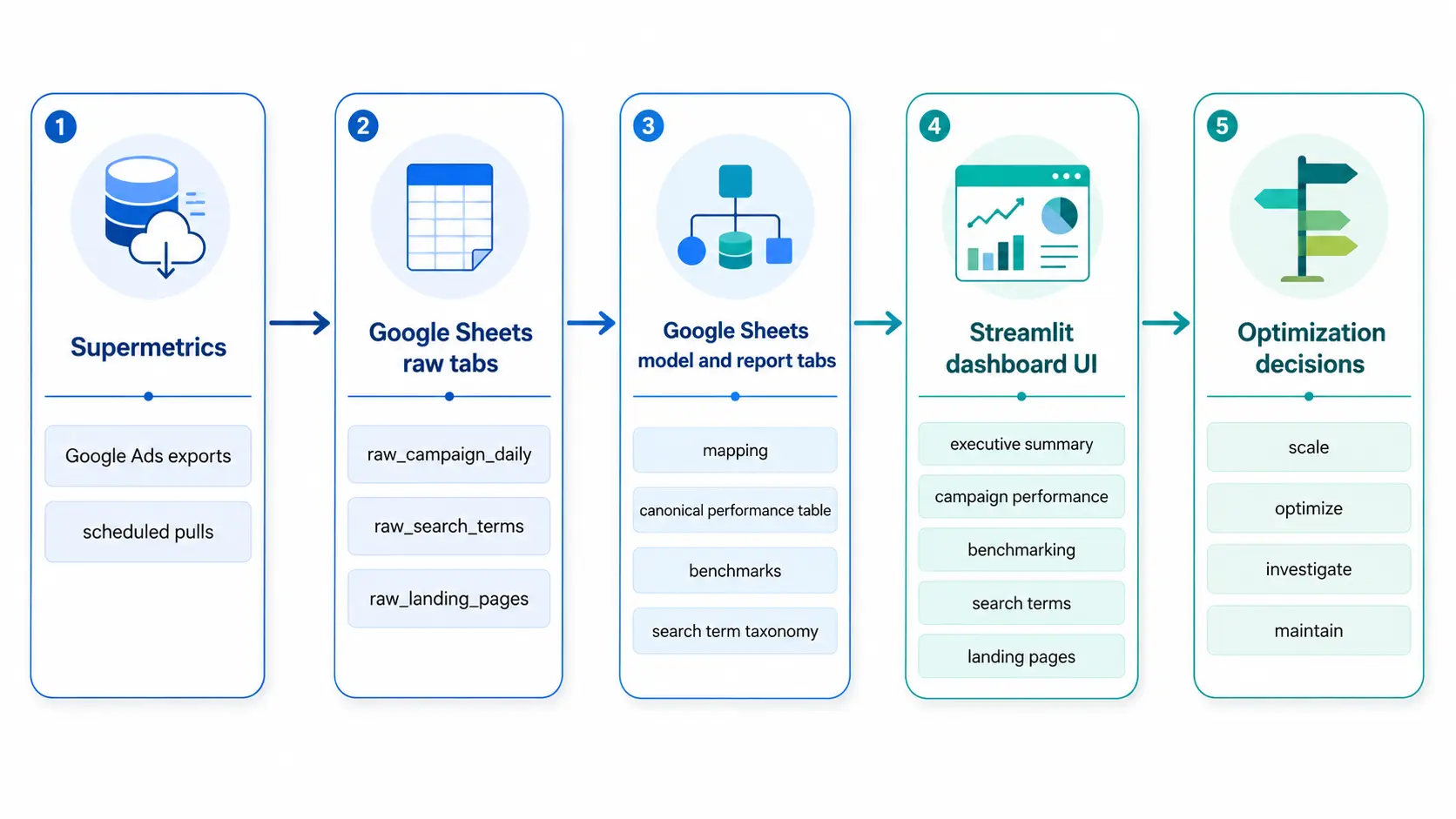
Each layer had a specific job.
Supermetrics handled the recurring Google Ads pulls. Those outputs landed in raw tabs, where the goal was to keep the data as close to the platform export as possible. From there, Google Sheets formulas handled the modeling layer: campaign mapping, conversion classification, search term taxonomy, benchmark calculations, and dashboard-ready report tables.
Streamlit was then responsible for the interface, not the core business logic. That distinction matters. The dashboard should not have to interpret every messy platform export in real time. It should consume clean, modeled reporting tables that already reflect the business definitions.
This is an important dashboard design principle: the internal system can be complex, but the visible interface should be focused. A dashboard should expose the decisions, not every layer of machinery underneath.
Better Dashboards Model Decisions, not just Data
A paid media dashboard does not need more charts. It needs a clearer point of view.
The question is not, “What can we visualize?” It is, “What decision should this help us make?”
That shift changes the entire build. Raw exports become modeled tables. Platform conversions get separated from business outcomes. Search terms become a workflow, not a data dump. Benchmarks provide context, not decoration.
The goal is not to recreate Google Ads in another interface. The goal is to make the next action obvious.
Scale what is working. Optimize what is inefficient. Investigate what looks misaligned. Maintain what is stable.
If a dashboard cannot help make those calls, it is not an optimization system. It is just a report.
Want the Template?
I’m turning this framework into a copyable Google Ads reporting workbook and adding it to the Five Nine Strategy Resource Hub.
The template includes the same general structure covered in this article:
- raw data tabs
- campaign and conversion mapping tabs
- model tables
- report-ready tabs
- benchmark logic
- QA checks
I’m also working on an anonymized Streamlit dashboard demo that uses sample data instead of client data.
You can find the template and related resources in the Resource Hub.